
I believe my advertising campaign as a whole successfully works. I tried to make it as intriguing as possible. It is consistent and the motifs present in the videos are also present throughout the digipack.


CD
Front Cover: I used a frame from one of the timelapses to attract the audience. I thought it would be a good idea to use familiar in order to trigger interest.
Back: I used a shot of Hannah with a television. This is an early idea that I never used. By using a similar shot, the idea is to keep the audience engaged.
Inside: A shot of a piano with a blue tone, as the album (including the first release 'Spiracle') is very piano-driven.
Images: At first I thought using two different shots of Hannah would be too much, but after much feedback people seemed to like the idea of having photographs of Hannah, after all this is her album. Once I made this, I also preferred this idea. I decided to have the out of fous shot of Hannah on the front without any text. I feel this is more striking and works with the title of the album 'Out of Focus'. I moved the text on to the spine as I had nothing there. I kept the inside simple, and relevant as I felt this would be better. With an obscure, abstract front cover I decided to tone it down a little and use one of the photographs from the first shoot.
Track Names: I tried to make up song names which fitted in with the theme of the song, 'Spiracle'. I wanted the album to have an ongoing theme. The theme is focused on the notion of remembering and looking back. I also included the album name as a track, and by the time I got to track number seven I was out of ideas. I used the word 'fuzz' as it reminded me of the televisions, a key motif throughout the process. The last track is called 'Warhola', similar to David Bowie's 'Andy Warhol', I did this as a tribute to the artist as it was a photograph of him that inspired me to work with televisions. I did not want to name the track after him, so I used his real last name.
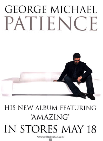
Poster: Embarrassingly enough, my album poster was inspired by this George Michael one. I simply liked the way the image blended into the background. I applied this theme to my poset, successfully in my opinion. As the CD features a DVD, and this is a key thing I need to sell, I made this text moderately larger than the text above. There is not a great deal to say about this piece of work. It is fairly basic. I decided to use a similar yet different shot on the poster in order to attract an audience. The idea is that they would recognize the consistency and continuity but at the same time realize it is a different photograph. This would engage the audience.
Together the video, the poster and the CD cover work together quite well. Each advertises the artist. There is a strong consistent theme running throughout.


No comments:
Post a Comment